#URBANFARMHOUSE BEFORE & AFTER HOUSE TOUR
- Laura Fox Interior Design, LLC

- May 1, 2018
- 3 min read
Updated: Jan 16, 2019
After looking through some before & after shots of past projects for upcoming presentations we felt that we just had to share some of these incredible transformations with our Foxy Faithful. We know that most of you have likely already seen photos from these finished projects either on the website, here on the blog, or on social media but there is just something about getting the pictures of the space before all of the changes and updates to really understand the full scope of the project.
So, we'll kick things off with one of our most popular projects, the #urbanfarmhouse. Prepare to be amazed!
Photo Credit: Stacy Zarin Goldberg Photography for Laura Fox Interior Design, LLC
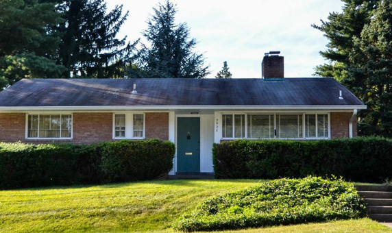
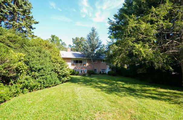
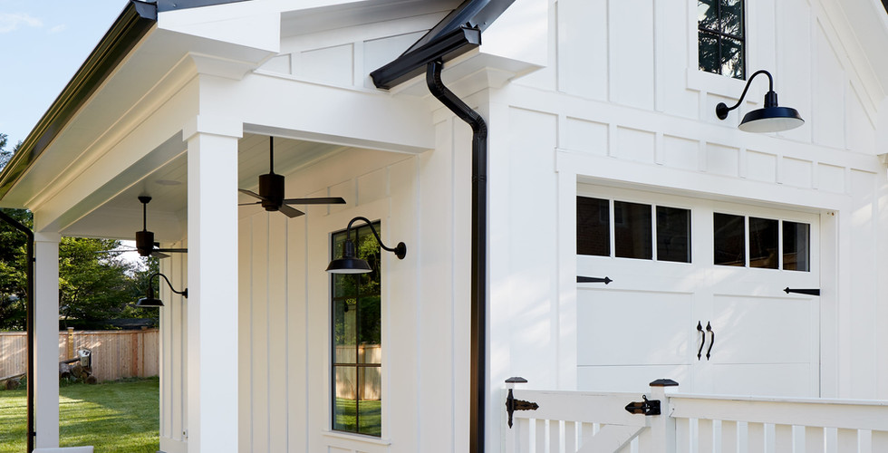
The transformation on this project was truly awe-inspiring. The client was a professional housing developer who brought Laura on board to design the home that he had purchased for himself and his girlfriend in Bethesda, MD after they realized shortly after starting construction that they needed help sorting through everything to hone in on a cohesive look.
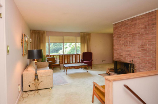
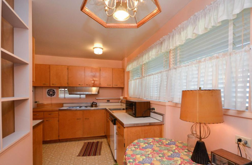
The project was a complete gut job/renovation and included a second and third story addition along with a full redesign of both the interior and exterior spaces. Click through the slideshows to see what this spectacular home looked like before Laura came on board to help turn this rambler that was stuck in the 1950s into the polished Modern Farmhouse that you see today.
Photo Credit: Stacy Zarin Goldberg Photography for Laura Fox Interior Design, LLC
Sources: Circa Lighting, Lillian August, Mike Weber, Noir
Laura worked with the client to finalize the new layout and create a laid back space that was perfect for family hangout time as well as entertaining guests. Higher ceilings and larger windows played off of each other to give the illusion of a much larger space. A very open furniture plan including a large sectional, reclaimed wood cocktail table, and gorgeous modern-styled wingback chairs helped to round out the new layout.
From there the items were draped in a light, neutral color palette with extreme contrast added through the use of a bold stripe, dark windows and doors, hand-rubbed black accent furniture, and a stunning, one of a kind piece of mixed-media art by LA-based artist, Mike Weber.
Photo Credit: Stacy Zarin Goldberg Photography for Laura Fox Interior Design, LLC
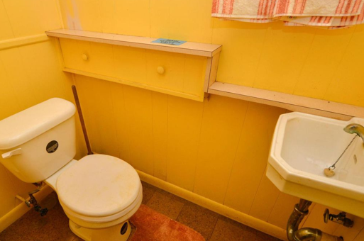
The desire to open up the space to make it brighter and more welcoming while bringing it into this century extended into the powder room. This was a space that, quite frankly, looked a bit like it came out of a horror movie but then turned into a cheerful little enclave with the addition of a window, some shiplap, natural wood accents, and a striking poured concrete sink.
Photo Credit: Stacy Zarin Goldberg Photography for Laura Fox Interior Design, LLC
Adding an entire additional story allowed the client to maximize space on the main level for family time as well as a necessary office space. Meanwhile, the bedrooms were all relocated to the new second floor space, allowing Laura to create an expansive master bedroom space that would become a peaceful sanctuary for the couple.
Photo Credit: Stacy Zarin Goldberg Photography for Laura Fox Interior Design, LLC
Sources: Lillian August, Victoria at Home, Visual Comfort,
In the same way that the additional floor allowed space to create a stunning master bedroom, it also provided the additional square footage for an oasis of a master bathroom, complete with soaking tub, walk-in shower, separate water closet, and an enormous vanity that would be the envy of any woman.
Photo Credit: Stacy Zarin Goldberg Photography for Laura Fox Interior Design, LLC
This home was such a treat to work on and we truly believe that the evolution from where it was to what it has become is simply incredible. Which part of this stunning renovation is your favorite? Comment below!
Stay Foxy!
Xoxo
Follow Fox Tales on Bloglovin!




















Comentários