To kick things off join us throughout January as we share the 2018 Colors of the Year – including Laura’s color pick! Every year the color gurus at companies such as Pantone, Sherwin Williams, and Benjamin Moore select a Color of the Year that they believe best represents the world around us at that time and the anticipated trends for the coming year.

Based on what the gurus have decreed, 2018 is looking bold! Vibrant jewel tones have been selected as the statement makers of 2018 and we are thrilled to see how such colors impact the design world through the coming months.
Over the next four weeks we will be focusing on one color each week so continue to check back for tips and tricks from your LFID design team on how to incorporate these colors into your spaces.
Photo Credit: Pantone
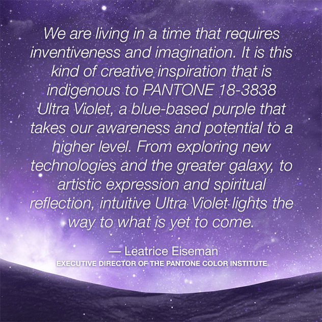
Week 1 (January 9): Pantone's Ultra Violet
"A dramatically provocative and thoughtful purple shade, PANTONE 18-3838 Ultra Violet communicates originality, ingenuity, and visionary thinking that points us toward the future."
Photo Credit: Sherwin Williams
Week 2 (January 16): Sherwin Williams' Oceanside
"A complex, deep color that offers a sense of the familiar with a hint of the unknown, Oceanside, bridges together a harmonious balance of blues and greens that can be found in what's old and new."
Photo Credit: Benjamin Moore
Week 3 (January 23): Benjamin Moore's Caliente
"Caliente is the signature color of a modern architectural masterpiece; a lush carpet rolled out for a grand arrival; the assured backdrop for a book-lined library; a powerful first impression on a glossy front door. The eye can’t help but follow its bold strokes. Harness the vitality.”
Week 4 (January 30): Laura's Color of the Year
Stop by on the 30th to find out what Laura's pick for Color of the Year is!
Check back next week for your LFID pointers on how to use Pantone's Ultra Violet in your design.
Stay Foxy!
Xoxo


Comments